17th Kingdom | Experimental LTD1000 (2022)

The design journey of the 17th Kingdom unfolds in two main phases. These stages involved extensive testing, numerous trials, and countless mock-ups. The first phase was experimental, designed to uncover any flaws and issues. The second and final phase aimed to address the unforeseen challenges that often are hard to spot during the design process.
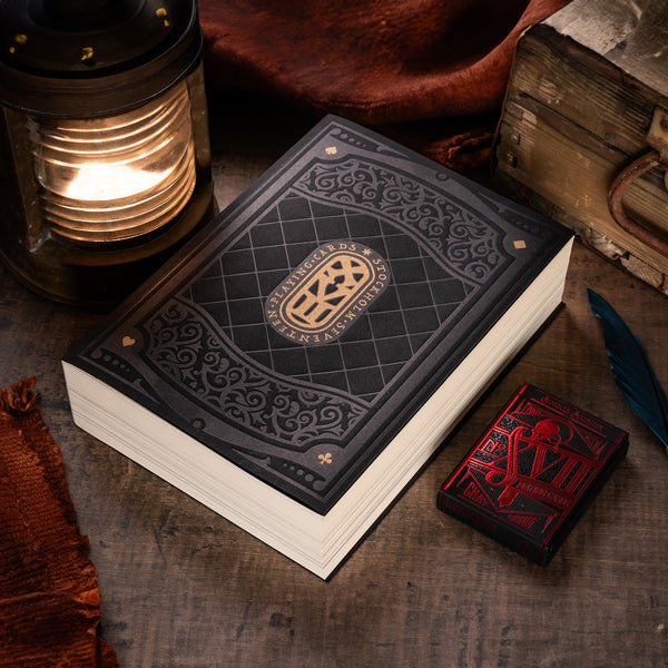
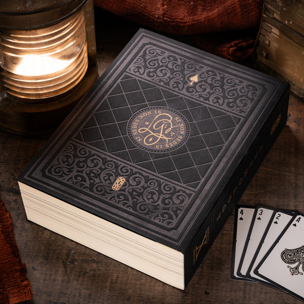
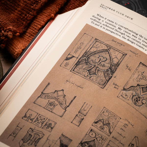
At the project’s inception, the idea revolved around creating an alternative tuckbox design that would expose the edges of a deck intended for the 2022 Patreon Edition. I toyed with the concept of a sort of sleeve featuring a glue-less front closure sealed by the golden XVII sigil, leaving the sides completely exposed. To make it work, it had to be a tight fit, as the paper would secure all 56 cards in place. The initial design of this sleeve was relatively simple; it looked promising on paper, but the first mock-up exposed a lengthy list of flaws and challenges I would face.
At that time, the notion of having uniquely shaped cards was not in consideration. In fact, the sketches centered around a standard poker-sized deck. The need to reveal the card edges was crucial because I was planning a special gilding process or printed graphics, similar to the Odd Fellow Cpt Spindel Webber or Eye of the Ocean’s Intrepid LTD333.
The concept of uniquely shaped cards, resembling hourglasses, emerged during sketching sessions on paper. I discovered that many print-on-demand services offered the potential for custom-shaped cards, often used for merchandise. This piqued my interest in experimenting with this idea, deviating from the fundamental design requirement of rectangular playing cards.

The project initially bore a temporary name, ‘Inverted Kingdoms’, and I contemplated playing with the notion of inverting graphic elements, colors, layouts, and what was possible to invert or flip. What remained certain was the experimental nature of this endeavor.
As with most experimental projects, adjustments are necessary after the initial run, and sometimes, things don’t work at all.
Thankfully, my design process incorporates the creation of mock-ups, which provide rapid insights into the feasibility of mass production. All I need are a printer and a cutter. Following some initial tests with regular cardboard, my next step was to consult the manufacturer directly.
Crafting this unique card shape necessitated the development of a specialized custom cutting tool, known as a ‘punch,’ to achieve the cards’ designed shape, which departs from the classic poker size with rounded corners. A straightforward technical drawing specifying dimensions and corner radii was sufficient to obtain a quote and secure manufacturer approval. The cards retain standard poker size dimensions (63x88mm), but two sides feature a central indentation with a small 3mm radius curve. This designated area became the canvas for the entire deck’s design.
The design process for what I renamed the ‘fold-box’ underwent numerous tests, trials, mock-ups, and a substantial amount of time. The final name for this experimental creation emerged with the assistance of my patrons, and I chose a fitting one: ‘The 17th Kingdom - Experimental.’ Timewise, the design of this deck did not follow a linear path. While I was developing and testing the dieline for the foldbox, I concurrently worked on the cards. I occasionally circled back to fine-tune the graphics of the foldbox, conducting color tests as well.
The hourglass-shaped opening on the box’s front elegantly showcases one of the cards. Initially, I contemplated designing the graphics on the back side to follow the lines of the opening. However, in the end, I decided to focus on the card faces, specifically the Ace of Spades and all the court cards. This time, I deferred the design of the court cards until after the foldbox, as it was essential to ensure the feasibility of production.
The initial idea of inverting the colors for the suits was discarded due to its potential for confusion, as it can be noticed on the first sketch of the Ace of Spades.

Creating the court cards posed no significant challenges, as I had to consider the area for the opening, leading to a dual-axis symmetry. The illustrations exhibit a dimensional shift where the faces and the headgear of the figures feature shading that adds depth, while the central part, adorned with geometric patterns and decorations, maintains a flatter appearance, ensuring a seamless transition.
The court cards flaunt a two-way design that aligns with the card’s shape, all featuring a diamond-shaped empty area in the center that matches the foldbox’s opening.


|
Patreon Reward 2022
1000 units Manufactured by WJPC, PRC SOLD OUT |
